
Picture this: you’re on your way home, scrolling through your phone, and you click on a website. Instead of clean text and easy navigation, you’re met with tiny fonts, oversized images, and clunky buttons. Chances are, you’ll close the tab immediately. That’s the reality for many websites that haven’t embraced responsive design. Today, more businesses are choosing affordable web design in Singapore to make sure their sites look good and work properly on every screen, whether it’s a phone, tablet, or computer.
Why Responsive Design Matters
The way people use the internet has changed. In Singapore, mobile browsing has become second nature, whether it’s ordering food, booking a service, or reading the news. If your site isn’t mobile-friendly, you’re not just inconveniencing visitors, you’re losing them. Responsive design keeps everything in proportion: text is easy to read, images scale neatly, and menus remain simple to navigate. Even better, Google rewards mobile-friendly websites by ranking them higher, giving your business greater visibility.
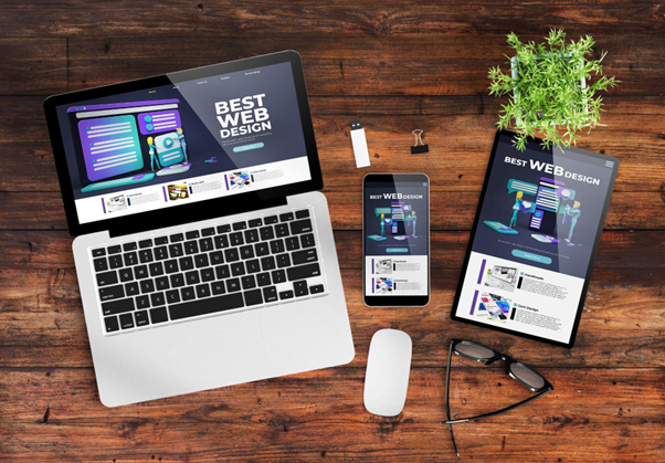
How Responsive Web Design Works
Responsive design is about flexibility. Instead of designing one site for desktop and another for mobile, the layout adjusts itself automatically. A wide three-column setup on a laptop might switch to one smooth column on a phone. Buttons resize, images shift, and menus reorganise themselves to suit the screen. When you work with a professional web design company in Singapore, they’ll build these features from the ground up, ensuring a seamless experience without you having to manage multiple versions of the same site.
Enhancing User Experience Across Devices
Think about how quickly people make decisions online. If a site takes too long to load or feels awkward to use, most visitors won’t wait around. Responsive websites not only look tidy, but they also load faster and reduce frustration. For online stores, this is critical; customers are much more likely to complete their purchases when the site runs smoothly. By making sure your site works across all devices, you’re essentially keeping the door open to every potential customer.
Balancing Design and Functionality
A beautiful website can catch attention, but if it’s slow or confusing, visitors won’t stay long. Flashy effects might work on a large screen, but they can quickly bog down a mobile site. That’s why professionals offering design services in Singapore focus on balance. They prioritise clarity and performance while still delivering an attractive design. A well-built site should feel effortless to use, not overwhelming or frustrating.
Common Pitfalls to Avoid
One of the biggest mistakes businesses make is creating separate desktop and mobile versions of their site. While it might seem like a solution, it often leads to inconsistent branding and extra maintenance. Another issue is neglecting to test the website across different devices. What looks fine on one phone might appear broken on another. Building responsiveness into your site from the start helps avoid these common problems and ensures a consistent experience for all users.
The Role of Professional Expertise
DIY site builders may be tempting, but they rarely deliver the same level of responsiveness as a professionally designed website. An experienced team knows how to test across devices, optimise loading speeds, and plan for future changes in technology. Working with a trusted web design company in Singapore means you’ll get a site that not only looks appealing but also adapts to new devices and browsing habits as they emerge.
Looking Ahead in Web Design
The digital world is constantly evolving. From foldable phones to larger monitors and voice navigation, new trends continue to shape how people interact with websites. Businesses that prioritise responsive design today will be better prepared for whatever comes next. At its core, responsiveness isn’t just about design; it’s about ensuring your site remains relevant, accessible, and customer-friendly.
Conclusion
Responsive web design is no longer just a nice-to-have. It’s what keeps your business visible, accessible, and competitive in a digital-first world. A site that adapts to every device creates happier users, better search rankings, and stronger customer trust. If you’re ready to take your website to the next level, now is the time to reach out to Right On Media and give your brand the online presence it deserves.